
Hue, Sonos and more controls at your fingertips – but it comes at a cost
The Rithum Switch is a great looking device that is easy(ish) to install and works well with the likes of Philips Hue and Sonos right out of the box, with additional integrations available – albeit at an extra cost. In the past few months the British brand have also expanded its capabilities and made it a more compelling smart home controller. However, it is quite a hefty outlay, albeit it’s much cheaper than the likes of Control4 and Crestron and provides a similar control experience, so smart home enthusiasts may well be tempted, especially if they are already using the Homey Pro.
Key features
- Installation: Multiple power options, but light switch with neutral present is best setup.
- Connectivity: Wi-Fi.
- Integrations: Philips Hue, Sonos, Tado, Homey, Lutron, BlueOS, Fibaro, Rako, Hdanywhere.
(Image credit: The Ambient)
The Rithum Switch Smart Home Control Panel is essentially a touchscreen control panel, designed to give you the sort of high-end experience you’d get with the likes of Control4 or Crestron, at a much smaller price-tag – it’s £249 in the UK.
Designed primarily to fit where an existing dumb light switch sits, as per the likes of Brilliant or Sonoff’s NSPanel Pro, the idea is to give you multiple lighting, sound and heating options where a simple on/off light switch once sat.
I initially posted this review back in August 2023 after I had the Rithum Switch installed for a few weeks.
However, the guys at Rithum – a British company – have made a few tweaks to the system in the past few months and have actually addressed a few points that I raised in my initial verdict.
So, read on for my full Rithum Switch review to find out why it now boasts our coveted Recommended badge.
Design and installation
- Ideally suited to a lightwitch with a neutral wire present
- Multiple alternative installation options also possible
Primarily, as mentioned in the intro, the best place to install the Rithum Switch is where you’ve currently got a normal light switch.
That’s because the size, shape and build is the exact design needed to slot into a regular UK/EU back box; UK square (71mm) and EU round (68mm) back boxes to be specific.
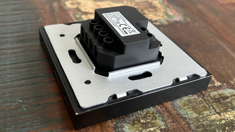
Things do get a tiny bit complex depending on how your lighting circuits are wired. In older houses you’ll probably find a neutral at the switch, which is good because the Rithum Switch needs a neutral to power it; you can’t just run your regular live/switch live light power through it and hope for the best.
In newer builds, and in houses where the electrics have been updated, you’re going to be lucky to find a neutral at the switch as they are normally found at the light fittings themselves.
Or, you may have switches that control multiple lights and you’ll find loads of wires behind the plate and you’ll be in a world of confusion.
Fear not though, because Rithum has guides on all matter of light switch and electric setups and you’re bound to find one that works for you, albeit with a bit of tinkering with your existing wires; there’s even options to power using PoE or a DC adapter.
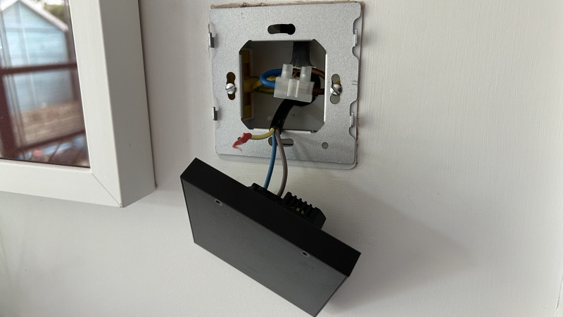
For me, the easiest route, was to simply wire my Switch into a regular plug socket, using an old cable I found in the garage. I could simply leave my single light switch wired permanently ‘on’ using a connector block, as it’s a Hue bulb that can be powered down in numerous other ways than a physical switch.
This isn’t really a normal setup at all, but it did the job, and was super easy as the wall I had the Switch installed on backs onto a storage cupboard in my garden office, so I wasn’t too concerned with keeping it neat and tidy behind.
Forgive the dodgy paintwork around the Switch in the picture, I’ve had numerous smart switches installed in the sport I tested the Rithum over the years.
The Rithum Switch installation process, once you’ve decided on a power option, is very easy; the device itself just pops off of that silver back plate – which gets screwed into a regular back box – and you just clip it back on. It’s a 5-minute job at most.
Once it’s powered on, and unlike what you’d expect from an Android tablet or a smart TV – or basically anything with a display nowadays, you aren’t presented with a setup screen. The Rithum logo comes up as it boots and then you are just presented with this:
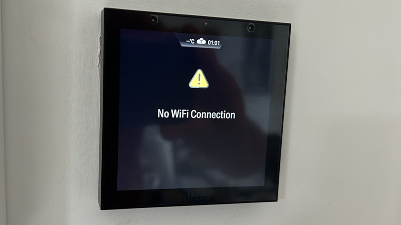
A few random taps later and I did find my way to the settings screen (it’s via that little notch up top) and was able to scan for Wi-Fi networks (2.4GHz only) and enter my home network’s password to get up and running.
The next thing to do is to set your location, via your postcode, so as you get the local time and weather info presented in that notch.
Once you’ve sorted your Wi-Fi and location out, the next thing to do is to setup your integrations…
Features
- Sonos and Hue work out of the box
- Other integrations are additional cost
- System is based around scene control
The thing to get your head around with the Rithum Switch is it is not a light switch, nor an app, it’s essentially a scenes controller and relies on you having your scenes and groups already setup and streamlined in whatever integrations you plan on using, whether that be Hue, Sonos or anything else.
It’s Sonos and Hue that work natively with the Rithum Switch and you are able to add in your systems after just a few taps through the setup menus.
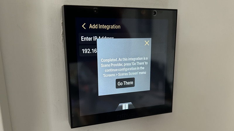
Philips Hue is a bit more clunky than Sonos, as a Hue Bridge is identified as an IP address, rather than just saying ‘Hue Bridge’, and you also have to tap your Bridge’s centre button to confirm access, but that’s about as complex as it gets.
Once synced, you’ll see all of your Hue rooms, zones and scenes available to choose within the Scenes menu.
When I first tested the Rithum Switch in the summer of 2023, there was no way of controlling individual Hue lights – either a basic on/off or colour control or dimming. It was limited to scenes, rooms and zones only.
However, more granular controls have been added to the mix, thanks to the new Levels feature, which is now live.
This lets you, using the icon on the right of the screen, fire up new screen where you can choose to alter the on/off status and the brightness of individual lights within a room.
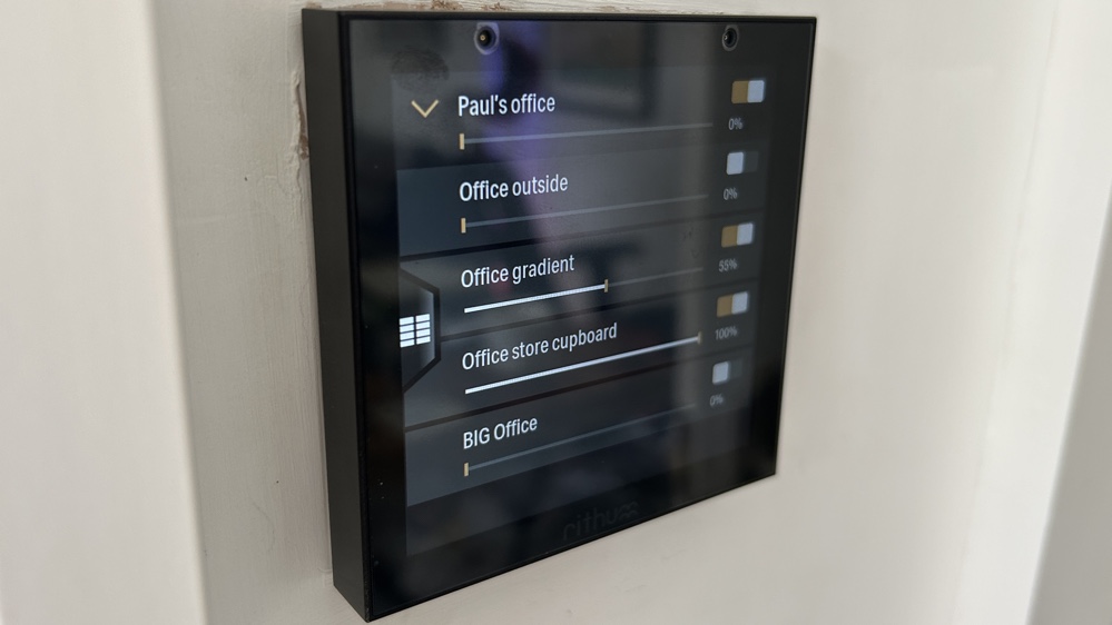
In my office, where I have the Rithum installed, I have a number of Hue bulbs and I can now control them more granularly. By default, it presents the room as whole, but once you tap the little orange arrow, you’ll be presented with all of the individual lights (and this view seems to stick, so you don’t have to do it every time.)
Sonos control is very similar to what you get with Control4 and works well on the whole. In terms of scenes, originally there were four pre-set scenes, of which I’d say none are all that useful. I don’t think I’ll ever need to control every single Sonos speaker I’ve got in one hit, from an individual room in my house.
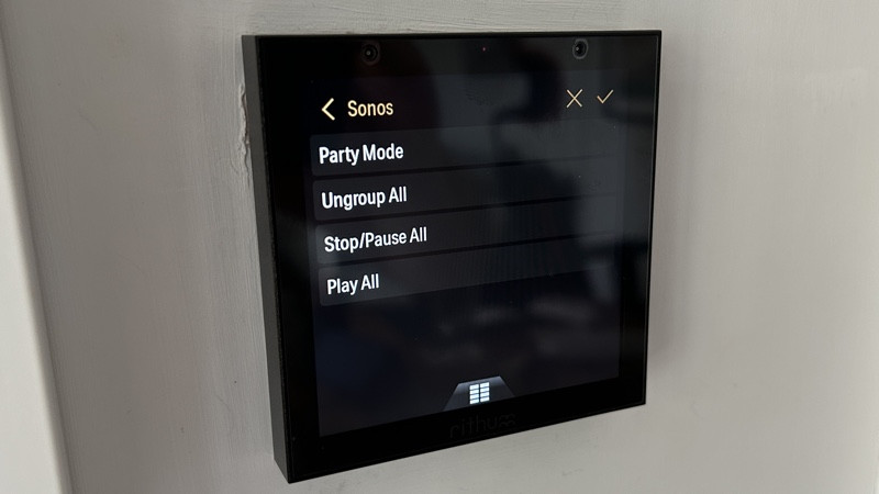
That’s partly because, although it obviously makes sense to control scenes in the room in which the Switch is installed, you aren’t limited to just controlling that room. The Rithum Switch doesn’t know where it’s installed, it just knows it is part of your network, so it can find and control and Sonos speaker or Hue light in your home.
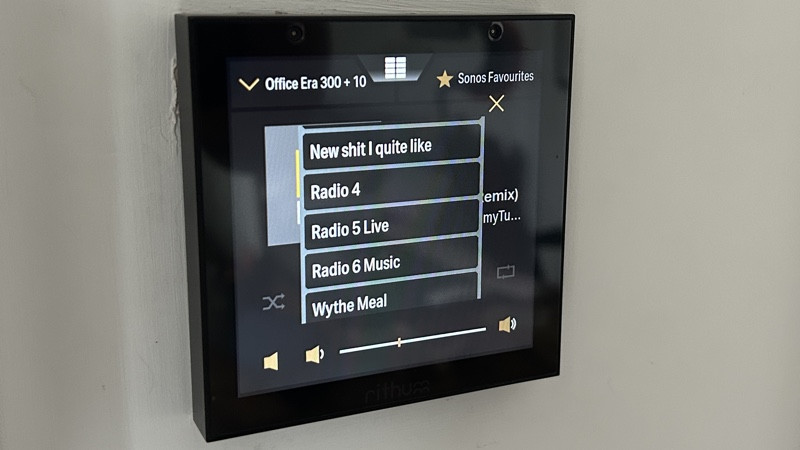
A new update since I originally tested the Rithum Switch though is some new Sonos controls, including the ability to play your Sonos Favourites in rooms or zones you determine, such as this scene I created where 6 Music plays on my office speakers:
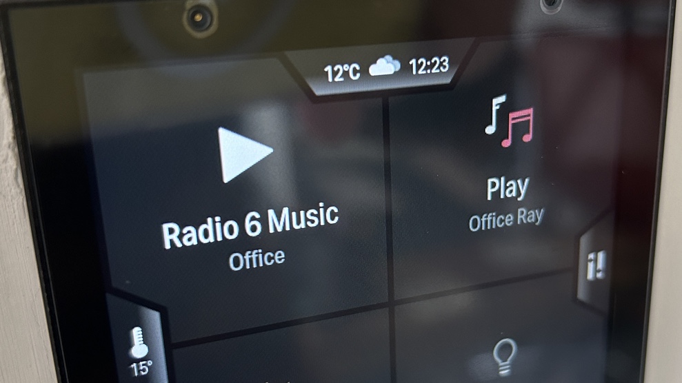
For controlling your Sonos system you simply use the media button – the little notch that comes up at the bottom of the homescreen and looks like a Hi-Fi equaliser.
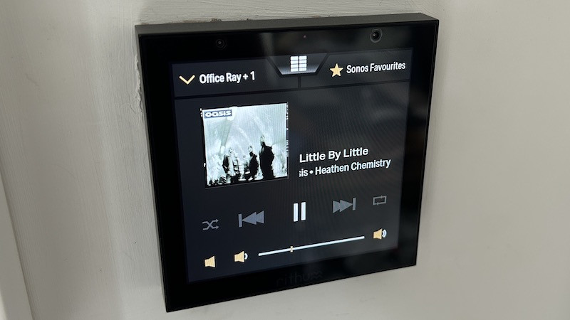
Once you tap this, you jump into a nice screen whereby you can scroll through all your Sonos Favourites, create groups, ungroup speakers and the like.
(Image credit: The Ambient)
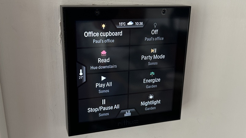
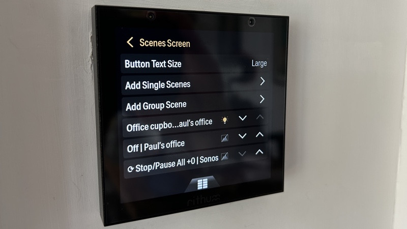
You can choose a maximum of 8 scenes and you can change the text and icon size of these in the settings menu.
You can create single scenes or group scenes, with the idea being with the latter that you can combine multiple scenes together that just require one tap to initiate; think turning on some lights to a dimmed setting and starting your music with just one tap.
(Image credit: The Ambient)
When the Switch wakes up from standby, with a quick tap, it’s the ‘Scenes Screen’ you are presented with and that really is the ultimate purpose of the Rithum Switch – to give you quick access to control devices and change their behaviours without having to open up separate apps.
However, it would be nice – as mentioned – to have individual light control, for example to create an even more bespoke controller.
The new Levels option does mean though, that this individual light control is only one tap away though, but it would be nice to pin a specific light to the homescreen.
What you can do though, on a room level at least, is toggle lights on and off using the standby gesture feature. Without waking the screen, you are able to tap and hold the display – before it wakes – to toggle the lights.
You can also use the gesture features for a double tap; I currently have it set to resume music playback on a specific Sonos speaker from where it left off.
If you do want to take things further and add a lot more scenes and automations into the mix then a Homey Pro is the way to go.
If you’re unaware, then the Homey Pro is a very powerful, multi-skilled smart home hub that works with an absolute plethora of smart home devices and brands.
Therefore, you get super detailed creating Homey automations (they call them ‘Flows’) and have these as the presets for your Rithum Switch scenes.
At nearly £600 for the two devices combined, plus £20 for the integration plugin, that’s a bit of a wallet-bash, for sure – but it’s still a fraction of what you’d pay for similar controls with the likes of Control4.
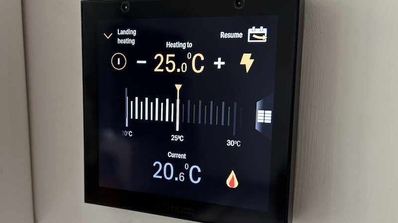
Back to what the Rithum can do natively and, at a £20 cost, you can also add a Tado smart heating system to the mix too.
This works really well, with the little thermometer icon on the left hand size pinging open an easy-to-use digital thermostat. You can toggle between Tado rooms and zone using the notch in the top left corner.
(Image credit: The Ambient)
You can set the heating by sliding the virtual dial and you can also resume your preset Tado schedule using the button in the top right corner.
There is actually a temperature sensor built into the Switch itself (at the bottom) which powers the Rithum Stat feature.
This is quite a nifty way, if you’ve got a lighting relay already in place with your boiler, of adding an extra smart thermostat to your home; simply pair it with a Zigbee relay from the likes of Shelly, Fibaro, Hue or Luton.
The Switch also offers a couple of neat gesture controls: hold for a certain light scene or double tap to resumer music playback, which are useful for the actions you’d use the most in the room where you have your Switch installed.
There is a proximity sensor up top of the Switch, which I thought would bring it to life when it was on standby and I walked past (or waved at it) but that wasn’t the case.
Additional plugins for the likes of Lutron, BlueOS, Fibaro, Rako and Hdanywhere are all available; you’ll need to talk to your regular pro-installer or dealer to get these up and running.
In everyday use
I’ll start with the positives and the overall experience with the Switch, once you’ve got yourself around the scenes-only setup, is pretty good.
Audio control is great, once you get your Sonos favourites sorted within the S2 app and the Tado integration is seamless.
But while the Rithum Switch works well, the overall navigation and wording used for the menus and settings is a bit complicated.
(Image credit: The Ambient)
I’ve got a Control4 system installed in my house and I found big comparisons between the user interface on the Rithum Switch and a Control4 touchscreen… and it’s not a great comparison; Control4 annoys the heck out of me too.
It’s just not as obvious and user friendly as it really should be. I’m a massive smart home nerd and I’ve spent years testing various smart home ecosystems, apps and controllers and if it’s not obvious to me how to do something then it’s going to be near impossible for a ‘regular’ user.
Touchscreen controllers and the UI they present needs to be super intuitive, and this is just isn’t at the moment.
The team behind Rithum boast that there is no additional app and no browser interface. And while that’s a good thing for streamlining the process and making the product as standalone as possible, I do actually think a more detailed smartphone companion app would improve the settings side a great deal.
Final thoughts
Back when I reviewed the Switch in August I said that, ultimately, as much as I’d like to as it’s a swanky looking piece of kit, I couldn’t highly recommend the Rithum Switch in its then current state.
I mentioned that it still feels somewhat like a work in progress and lamented that, while some features work really well, everything felt a bit limited, and you’d need to tap into something like the Homey Pro to really make use of its scenes-first approach.
I concluded that essentially, it was nearly there.
Fast forward six months or so and is it there now then? I’d say yes.
It’s not perfect still and it is still too pricey for enthusiast to take a punt on, as you can tinker around with something like the NSPanel Pro for a similar experience, at a fraction of the price.
But the improvements with levels, Sonos Favourites and the group scenes have elevated the Rithum Switch to a new level.
But, more than that, the commitment from the brand to make these improvements prove that the Switch is a worthwhile investment and I get the feeling that the device will go from strength to strength and the community expands.
I Iook forward to testing out any new features and integrations as they drop, but for now I’m happy to bump up my original score and give the Rithum Switch my recommendation.
How we test
When we publish our reviews, you can rest assured that they are the result of “living with” long term tests.
Smart switches usually live within an ecosystem, or a range of products that – supposedly – all work in harmony. Therefore, it’s impossible to use a device for a week and deliver a verdict.
Because we’re testing smart home kit all day, everyday, we know what matters and how a particular device compares to alternatives that you might also be considering.
Our reviews are comprehensive, objective and fair and, of course, we are never paid directly to review a device.
Read our full guide on How We Test to find out more.
FAQS
Do you need a neutral wire for the Rithum Switch?
No, there are workarounds and tweaks if you don’t have a neutral wire at your light switch.
Does the Rithum Switch have Zigbee?
No, it’s Wi-Fi only – if you want something similar that also has a Zigbee controller then check out the NSPanel Pro from Sonoff.
Does the Rithum Switch have Alexa or Google Assistant?
There’s currently no voice assistant integrations for the Rithum Switch.
Full product name: Specs
| Type | Type and colors | |
| UK RRP | £249 | |
| US RRP | N/A | |
| Size | 86mm x 86mm | |
| Back box depth | 35mm | |
| Wi-Fi | 2.4GHz 802.11bgn | |
| Integrations | Philips Hue, Sonos, Tado, Homey, Lutron, BlueOS, Fibaro, Rako, Hdanywhere. | |
| Display | 480 x 480 | |
| Operating System | Proprietary |


